
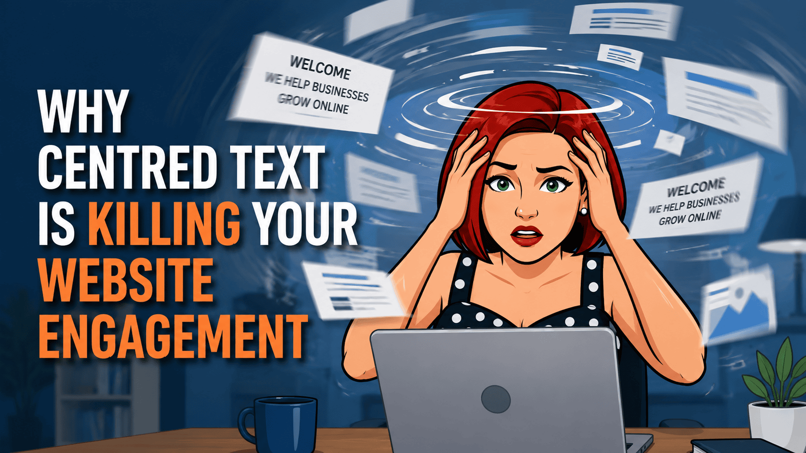
Ever landed on a website and felt your eyes dancing all over the place trying to read the content?
You are not alone. I see it every week: businesses with centred body text wondering why visitors leave so quickly. They think it looks “elegant” or “professional”, but it is often bleeding engagement and quietly sabotaging their SEO.
Let me show you why centred text is one of the worst design choices you can make for body copy, how it hurts your rankings, and what to do instead.
What's inside? (TL;DR)
Centred body text can make your website harder to read, especially on mobile.
This article explains why that hurts engagement, trust, accessibility, and SEO, then shows the simple fix most sites can make quickly.
Useful Sections
Estimated reading time: 12 minutes
The Science Of How We Read
Your eyes are not random. When reading English text, they follow a predictable pattern, scanning left to right and using the left margin as an anchor point to find the next line.
This is not preference. It is how our brains process text efficiently after years of reading left-aligned books, newspapers, documents, and websites.
When text is centred, that anchor disappears. Your eyes must hunt for the start of each new line, creating cognitive load. In plain English, your brain has to work harder just to read the thing in front of it.
Think about it: when was the last time you read a centred book? There is a reason publishers have stuck with left alignment for centuries.
Experience It Yourself: The Centred Text Challenge
Still not convinced? Try a quick experiment.
This entire section is centred. Each line starts in a slightly different place. Your eyes have to search for the beginning of each new line, your reading flow keeps breaking, and the whole thing starts to feel more annoying than it should.
That is what your visitors experience when your body copy is centred.
You might have brilliant content, helpful information, and exactly what your visitors need, but they may never know because they cannot comfortably read it.
Even a short paragraph can become tiring. Now multiply that frustration across your whole website.
How Centred Text Hurts Engagement
Here is where it gets expensive.
When visitors struggle to read your content, they do not struggle for long. They leave.
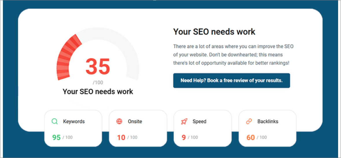
I recently audited a Bedford recruiter’s website. The design looked good at first glance. The content was decent. But every page had centred paragraphs.
Their analytics told the brutal truth:
Average time on page: 23 seconds
Scroll depth: 12%
Pages per session: 1.2
Mobile engagement: 94% left without any interaction
They were bleeding visitors, and they had no idea why.
The Mobile Disaster
Centred text on desktop is annoying. On mobile, it is a conversion killer.
With narrower screens, line lengths vary dramatically. One line might have eight words, the next has three. Your visitors’ eyes ping-pong across the screen like they are watching tennis.
In a mobile-first world, that is not a minor design preference. It is a usability problem.
Why Google Cares About Your Text Alignment
“But Michael,” you might be thinking, “does Google really care about text alignment?”
Here is the truth. Google can see your CSS styling, but what matters more is what happens next:
Minimal scroll depth because visitors do not read past the first section.
Low time on page because they do not stick around to struggle.
No meaningful interactions because they are not clicking links or buttons.
Quick returns to search because they did not find the experience useful.
Google wants to understand whether users are satisfied. When centred text frustrates visitors, those engagement signals can suggest poor content, even if the actual content is useful.
Your rankings can suffer. Not because your keywords are wrong, but because a simple design choice is getting in the reader’s way.
The Professional Perception Problem
Beyond the measurable metrics, there is also a credibility issue.
Centred body text can make a site feel amateur. It is the digital equivalent of using Comic Sans on a business card. Technically readable, but not exactly filling people with confidence.
First impressions matter. Poor alignment choices can undermine your credibility before visitors even get to your message.
Real Examples: The Good, The Bad, And The Ugly
Look at how successful websites handle text alignment.
The good:
BBC News uses left-aligned body text.
Amazon uses left-aligned product descriptions.
GOV.UK uses left-aligned content, and they test this stuff properly.
The bad:
Local restaurant sites that centre everything.
Old-school service businesses stuck in older design habits.
DIY websites where templates default to centred sections.
The ugly:
Sites that mix alignments randomly.
Centred paragraphs combined with justified text.
Mobile layouts that do not adjust properly for smaller screens.
Notice the pattern? Websites that depend on engagement usually use left alignment for body copy. They know what works.
Industry-Specific Impact: Where Centred Text Hurts Most
Some industries suffer more than others from poor text alignment. Trust-based sectors feel it hardest.
Legal Services
Solicitors and law firms need to convey authority and professionalism. Centred body text weakens that. When you are asking clients to trust you with serious legal matters, every design choice matters.
Financial Services
Accountants, financial advisers, and mortgage brokers deal with people’s money. Centred text makes detailed information harder to digest, which is exactly what you do not want when explaining complex financial topics.
Healthcare
Medical practices and healthcare providers need clear, accessible communication. Centred text creates barriers for patients trying to understand important information.
Trade Services
Plumbers, electricians, and builders often list services, coverage areas, and pricing. Centred text makes these details harder to scan. In an emergency, people will not wrestle with your layout. They will call someone else.
Professional Services
Consultants, recruiters, and marketing agencies need to explain complex services clearly. Centred paragraphs make it harder for prospects to understand what you do and how you can help.
The pattern is clear: the more trust your industry requires, the more damage centred text can do.
Related Alignment Mistakes That Compound The Problem
Centred text rarely travels alone. It often brings friends.
Justified Text
Some sites try to make text look tidy by justifying it, stretching words to create straight edges on both sides. This can create awkward rivers of white space through the text, making it harder to read.
Inconsistent Alignment
Centre here. Left there. Right somewhere else for “variety”. That creates visual chaos. Your visitors’ eyes never know where to look next.
Narrow Columns With Centred Text
Centred text in narrow columns is particularly brutal. Short lines with changing start points make reading feel like work.
Spot any of these alongside centred body copy, and you are looking at compound readability problems.
The Accessibility Problem
Here is something every business owner should care about. According to the British Dyslexia Association, around 10% of the UK population has dyslexia. For those visitors, centred text is not just irritating. It can be genuinely difficult to read.
The Web Content Accessibility Guidelines recommend avoiding fully justified text and making content easy to read. Left-aligned body text is usually the safer, clearer choice.
It is not only about dyslexia either. Centred body text can also affect:
visitors with visual processing difficulties
people reading in their second language
anyone with mild visual impairments
users with cognitive disabilities
Accessible design is good design. And good design is good for SEO.
Why Centred Text Still Exists
Centred text dominated early web design for practical reasons. In the 1990s, with basic HTML and varying screen sizes, centring often felt like the safest way to stop content hugging one edge.
Desktop publishing also helped cement the idea that centred layouts looked “elegant”. Old habits die hard.
But what works on a certificate, invitation, or poster does not automatically work on a website.
Print is static. Web content is dynamic. People read it on phones, tablets, laptops, and desktops. Your design choices need to support that.
The web has moved on. Your body text should too.
When Centred Text Actually Works
I am not completely anti-centre. There are specific, limited uses where centred alignment can work:
hero headlines
short, punchy statements
pull quotes
isolated testimonials
single call-to-action sections
poetry or artistic text where form matters more than function
The key word is “limited”.
Centred text can work for isolated design elements. It should not be used for your main body copy.
The Psychology Of Reading Comfort
Here is what often happens when a visitor lands on a page full of centred text:
Initial confusion: “Why does this feel hard to read?”
Increased effort: working harder just to follow the content.
Growing frustration: “This is taking too long.”
Decision point: keep struggling or leave.
Exit: they hit the back button.
This happens quickly. Often subconsciously.
They may not even realise why they left. They just know your site felt difficult.
Mad concept, right? You can have the best content in your industry, but if it is hard to read, nobody will ever know.
How To Fix Your Text Alignment
The good news? This is one of the easiest website fixes you can make.
If you are not sure how to make the change yourself, ask your website designer to handle it.
For WordPress Sites
Go to Appearance.
Open Customize.
Go to Additional CSS.
Add this if appropriate for your theme:
p { text-align: left !important; }Save and refresh.
Only use that CSS if you understand what it affects. Some themes and page builders need a more careful approach, so test before assuming the job is done.
For Other Platforms
Find where your paragraph styling is controlled.
Look for
text-align: centeron paragraph or text block settings.Change body copy to left alignment.
Save and test.
What To Check
Look at:
blog posts and articles
service descriptions
product descriptions
About pages
homepage sections with more than two lines of text
mobile versions especially
If you are using a page builder, look for the alignment controls and choose left alignment for body text. It is often that simple.
Measuring The Impact Of Your Fix
After fixing your text alignment, monitor the results.
Week 1–2
Look for:
better time on page
improved scroll depth
stronger interaction rates
Month 1
You may see engagement metrics continue improving as more visitors experience the cleaned-up layout.
Month 3
If the affected pages are important SEO pages, improved engagement can support stronger performance over time.
One client saw their average session duration jump from 47 seconds to 2 minutes 34 seconds after fixing text alignment. Their conversions increased by 31% with no other changes.
That is not magic. That is what happens when visitors can actually read the content.
The Compound Effect With Other Improvements
Text alignment might seem like a small detail, but it affects everything around it.
Better readability leads to more engagement. More engagement creates stronger user signals. Stronger user signals can support better rankings. Better rankings bring more traffic. More traffic combined with better readability can mean more enquiries.
It is a foundation issue.
Get it wrong, and your other efforts have to work harder. Get it right, and everything feels easier for the reader.
Convincing Your Designer
“But it looks more elegant centred.”
Lovely. But elegance does not pay the bills. Conversions do.
If your designer resists changing to left alignment, here is how to approach it.
Show Them The Data
Use your analytics. Look at time on page, scroll depth, and mobile engagement. Compare pages where the text is easier to read against pages where it is centred.
Point To Major Websites
Look at serious websites in your industry. The ones that depend on trust, clarity, and action usually use left-aligned body copy.
Offer A Sensible Compromise
Keep centred alignment for short hero sections, pull quotes, and isolated calls to action. Use left alignment for paragraphs, service descriptions, and anything visitors need to read properly.
Good designers care about user experience above decoration. If the site looks pretty but people cannot use it, the design has failed.
Common Objections
“But Centred Text Looks More Elegant”
Maybe in a wedding invitation. Less so in a 700-word service page.
Use centred text where it adds emphasis. Do not use it where people need to read.
“My Designer Says It Is More Modern”
Modern users expect usability. A page that is hard to read does not become modern because someone centred it.
“Our Brand Guidelines Require Centred Text”
Then your brand guidelines may need updating. Brand rules should support business results, not sabotage them.
“But Our Competitors Use Centred Text”
Excellent. Let them frustrate their visitors while you make your content easier to read.
Your Action Plan
Audit your site today. Check every page with more than 50 words of content.
Fix your main pages first. Start with your homepage, services, and About page.
Test on mobile. This is where the biggest impact usually appears.
Monitor your metrics. Use analytics to track time on page, scroll depth, and conversions.
Keep centred text only where it genuinely helps.
This is not complex. It does not always require a developer. You may be able to fix it in under an hour.
But the impact can be surprisingly large.
The Bottom Line
Centred body text can damage website engagement, and poor engagement can damage SEO. It is that simple.
While others obsess over backlinks and keyword density, you can often improve performance just by making your content easier to read.
Sometimes the basics matter more than the clever stuff.
Left-align your body copy. Make life easier for your visitors. Thank me later.
Can We Help?
Many people end up on our blog because their SEO is not working the way they hoped, and they are trying to work out what to do next.
Sound familiar?
If your website looks tidy but visitors are not sticking around, the issue may not be your offer.
It might be the way the page is designed that makes people work to understand it. We can review the structure, readability, mobile experience, and SEO basics so you know what is helping, what is hurting, and what needs sorting first.